Lesson 12
Data Visualization with Python
Big question
What should a figure reveal that a table or coefficient cannot show as clearly?
Lesson progress
Complete checkpoints as you learn
Learning objectives
- Construct line, scatter, distribution, and categorical charts.
- Label units, sources, and transformations.
- Design for accessibility and grayscale printing.
- Recognize misleading scales and overplotting.
- Prerequisites: Chapters 8 to 11.
- Key terms: figure, axes, encoding, scale, annotation, accessibility.
Simple explanation
A figure maps variables to position, length, shape, and sometimes colour. Position along a common scale is usually easier to compare than area or angle. Time belongs on an ordered horizontal axis; distributions need enough bins or a density representation; uncertainty should be shown when it affects interpretation. Matplotlib exposes the figure and axes objects that control these choices (Matplotlib Development Team 2026).
Key terms
- Construct line, scatter, distribution, and categorical charts
- A core idea in Chapter 12 that students apply carefully in economic analysis.
- Label units, sources, and transformations
- A core idea in Chapter 12 that students apply carefully in economic analysis.
- Design for accessibility and grayscale printing
- A core idea in Chapter 12 that students apply carefully in economic analysis.
- Recognize misleading scales and overplotting
- A core idea in Chapter 12 that students apply carefully in economic analysis.
- Prerequisites: Chapters 8 to 11
- A core idea in Chapter 12 that students apply carefully in economic analysis.
- Key terms: figure, axes, encoding, scale, annotation, accessibility
- A core idea in Chapter 12 that students apply carefully in economic analysis.
Analytical workflow
Interpret the expression in words and units before using it in a claim.
Example
Interpretation. The code creates a reusable figure object and labels both the time dimension and the unit.
Prerequisites
- Complete the preceding course chapters or review their summaries as needed.
Full theory and examples
12.2
A chart is an argument with visual grammar
A figure maps variables to position, length, shape, and sometimes colour. Position along a common scale is usually easier to compare than area or angle. Time belongs on an ordered horizontal axis; distributions need enough bins or a density representation; uncertainty should be shown when it affects interpretation. Matplotlib exposes the figure and axes objects that control these choices (Matplotlib Development Team 2026).
12.3
Labels protect meaning
A title should state the subject, not merely repeat a variable name. Axes need units, transformations, and frequency. A source note should identify the provider and whether values were calculated by the author. Legends are useful when direct labels are impractical. An annotation can point to a recession, policy change, or data break, but decoration should not compete with the evidence.
12.4
Accessibility is part of accuracy
Colour should not be the only channel distinguishing categories. Contrasting line styles, markers, labels, and sufficient luminance differences help readers with colour-vision differences and support grayscale printing. Truncated axes can exaggerate small changes, while dual axes can imply relationships that depend on arbitrary scaling. The default chart should be honest before it is beautiful.
12.5
Python demonstrations
12.5.1
Demonstration 12.1: A labelled time-series chart
Verified output
Interpretation. The code creates a reusable figure object and labels both the time dimension and the unit.
12.5.2
Demonstration 12.2: A distribution check
Verified output
Interpretation. The histogram reveals tails and concentration that a standard deviation alone cannot convey.
12.6
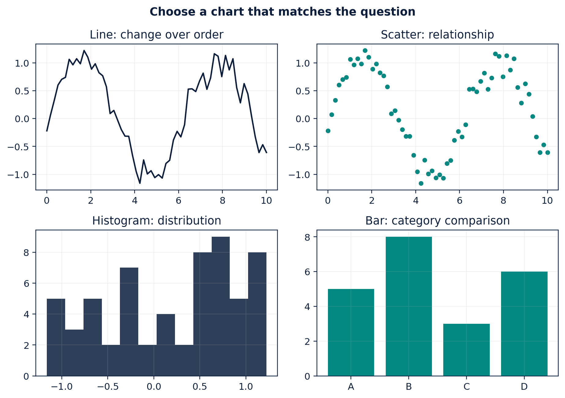
Visual evidence
12.7
Reference table
Why This Matters
Visualization is a diagnostic instrument as well as a communication device.
Common Mistake
Selecting a chart type because it looks impressive rather than because it matches the analytical question.
Ceteris LAB Tip
Before exporting, inspect the chart at the size students will actually see in the PDF or website.
R-to-Python / Source Bridge
All low-resolution source figures were recreated as original Python visuals. The new figure library uses consistent captions, labels, and Ceteris LAB styling rather than slide screenshots.
| Question | Recommended chart | Common caution |
|---|---|---|
| How does a variable evolve? | line chart | gaps and frequency |
| How are two variables related? | scatterplot | overplotting and causality |
| What is the distribution? | histogram/density/boxplot | bin and bandwidth choices |
| How do categories compare? | bar or dot plot | zero baseline for bars |
Visual evidence
Additional Python demonstrations
Live Python
Source demonstration 2
Source demonstration 2
Stdout
Run Python to see results here.
Status / stderr
Ready to run Python in your browser.
Line-by-line guide
- Line 1Load a Python library needed for data work or regression.
- Line 2Load a Python library needed for data work or regression.
- Line 4Create or update a Python object used in the analysis.
- Line 5Create or update a Python object used in the analysis.
- Line 6Create or update a Python object used in the analysis.
- Line 7Create or update a Python object used in the analysis.
- Line 8Create or update a Python object used in the analysis.
- Line 9Run this Python instruction as part of the lesson workflow.
- Line 10Display a result so students can inspect the output.
Verified source output
4
1.263
Interpretation. The code creates a reusable figure object and labels both the time dimension and the unit.
Interpretation. The histogram reveals tails and concentration that a standard deviation alone cannot convey.
Guided practice
- 1Re-run Demonstration 12.1 and change one input while keeping the analytical question fixed.
- 2Explain in two sentences how the output supports, or fails to support, the chapter opening question.
- 3Add one validation check that would prevent a plausible error.
Exercises
- 1Create a line chart with units and source note.
- 2Compare a histogram under two bin choices.
- 3Create a scatterplot and add a fitted line.
- 4Redesign a misleading truncated-axis chart.
Source and downloads
Chapter 12 of Fundamentals of Python for Financial Econometrics by Mohammad Safavi, Ph.D.. The lesson is an original Ceteris Lab web adaptation of the supplied publication package.
Live Python
Data Visualization with Python: live Python
Data Visualization with Python: live Python
Stdout
Run Python to see results here.
Status / stderr
Ready to run Python in your browser.
Line-by-line guide
- Line 1Load a Python library needed for data work or regression.
- Line 2Load a Python library needed for data work or regression.
- Line 4Create or update a Python object used in the analysis.
- Line 5Create or update a Python object used in the analysis.
- Line 6Create or update a Python object used in the analysis.
- Line 7Create or update a Python object used in the analysis.
- Line 8Run this Python instruction as part of the lesson workflow.
- Line 9Run this Python instruction as part of the lesson workflow.
- Line 10Display a result so students can inspect the output.
Python walkthrough
- 1`import matplotlib.pyplot as plt`: Loads a package or function used by the analysis.
- 2`import pandas as pd`: Loads a package or function used by the analysis.
- 3`series = pd.Series([1.2, 1.4, 1.3, 1.6], index=pd.date_range("2026-01-01", periods=4, freq="`: Creates or updates a named object used by later steps.
- 4`fig, ax = plt.subplots()`: Creates visual evidence that should be interpreted with labelled units and context.
- 5`ax.plot(series.index, series.values, marker="o")`: Creates visual evidence that should be interpreted with labelled units and context.
- 6`ax.set(title="Illustrative Monthly Index", xlabel="Month", ylabel="Index points")`: Creates or updates a named object used by later steps.
- 7`fig.tight_layout()`: Executes the next transparent step in the workflow.
- 8`plt.close(fig)`: Executes the next transparent step in the workflow.
- 9`print(len(series))`: Displays a result so it can be checked and interpreted.
Live notebook
Run this lesson as a notebook
Open an editable notebook cell-by-cell, run Python in the browser, and download the `.ipynb` file for later.
Related dataset
Ceteris Lab teaching sample
Estimated time
25 to 40 min
Packages
pandas, numpy, matplotlib
Expected output
A printed summary plus a chart in the output panel.
Learning goals
- Load and inspect Ceteris Lab teaching sample.
- Run the Python cells connected to Data Visualization with Python.
- Interpret the output using Construct line, scatter, distribution, and categorical charts and Label units, sources, and transformations.
Common errors
- File not found: check that wage_sample.csv is installed or use the course data folder.
- Package import error: use the browser notebook first, then download for local Jupyter if your local packages differ.
- Column name error: compare your variable names with the dataset variables listed for this notebook.
Dataset path helper
import pandas as pd

df = pd.read_csv("/data/wage_sample.csv")
df.head()
Interactive activity
Chapter 12 interactive
Data evidence planner
Which choice makes an exploratory result easier to defend?
Immediate feedback
Choose a decision, then test how the claim changes as evidence becomes stronger or weaker.
Try it yourself
Write one plain-English sentence explaining the main idea from this lesson.
Common mistakes
Check these before you move on.
Return to the lesson assumptions, units, diagnostics, and source evidence to replace this shortcut with a defensible interpretation.
Quick quiz
Which statement best answers the Chapter 12 opening question: What should a figure reveal that a table or coefficient cannot show as clearly?
Quick quiz
Which practice should be avoided when applying Data Visualization with Python?
Quick quiz
What is the most defensible way to interpret the Python demonstration?
Quick quiz
Why does Chapter 12 matter in an applied econometrics workflow?
Key takeaway
Charts map data to visual channels. Titles, units, sources, and transformations protect interpretation. Accessible design improves accuracy for every reader.